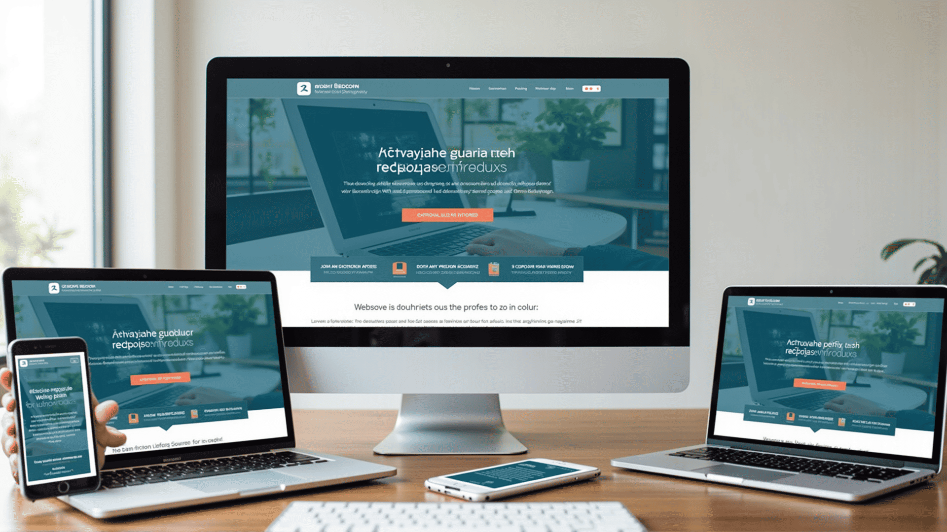
In today's digital landscape, creating a web experience that seamlessly adapts to various devices and screen sizes is essential. Responsive design is a method of web design that ensures a website looks and functions well on all devices—whether it's a desktop, tablet, or smartphone.
Understanding the principles of responsive design is the first step. Key elements include fluid grids, flexible images, and CSS media queries. Fluid grids allow the layout to adjust proportionally to the screen size. Unlike fixed-width layouts, fluid grids use relative units like percentages rather than pixels, enabling the design to scale consistently across different devices.
Flexible images are integral to responsive design. By using CSS techniques like max-width: 100%, images automatically resize within their containing elements, preventing them from exceeding their container's boundaries. This ensures images are not only viewable on smaller screens but also maintain their quality and clarity.
CSS media queries are perhaps the most powerful tool in the responsive design toolkit. They enable designers to apply specific CSS rules based on characteristics like screen resolution, orientation, or viewport width. For instance, a media query can adjust the font size or layout style when viewed on smaller devices, ensuring textual content remains readable and visually appealing.
Another aspect of responsive design is the concept of mobile-first development. This approach involves designing for the smallest screen first and then progressively enhancing the web experience as the screen size increases. By focusing on the essential elements that users need on smaller screens, designers prioritize usability and accessibility, avoiding unnecessary features that might clutter a mobile interface.
Typography is also crucial in responsive design. Selecting web fonts that scale well and setting appropriate line heights enhances readability across devices. Ensuring sufficient contrast between text and background further improves accessibility for users with visual impairments.
A responsive design also benefits from utilizing scalable vector graphics (SVGs) instead of traditional image formats like PNG or JPEG. SVGs are resolution-independent and can be scaled to any size without losing quality, offering crisp and clear graphics on all screens.
Responsive design extends beyond aesthetic considerations. It enhances usability by ensuring menus, buttons, and other interactive elements are easily tappable on touch screens. Implementing touch-friendly interactions improves user experience on mobile devices, encouraging engagement and helping users navigate more efficiently.
Testing is an integral phase in responsive design. With various devices and browsers available, thorough testing ensures compatibility and performance across platforms. Tools like Chrome DevTools and Firefox Responsive Design Mode allow designers to simulate different devices, making it easier to identify and fix issues early in the development process.
In conclusion, responsive design is an essential practice for creating versatile and user-friendly websites. By embracing fluid grids, flexible images, media queries, and a mobile-first approach, designers can craft beautiful and functional websites that cater to the diverse needs of users in an ever-evolving digital world. Through diligent testing and optimization, responsive design ultimately enhances both accessibility and usability, providing a cohesive experience on any device.