The art of creating visually pleasing websites relies on a delicate balance of colors, typography, and layout. A well-crafted site immediately communicates its purpose and enhances user experience, making the journey through digital content not just a necessity but a delight.
Color Harmony
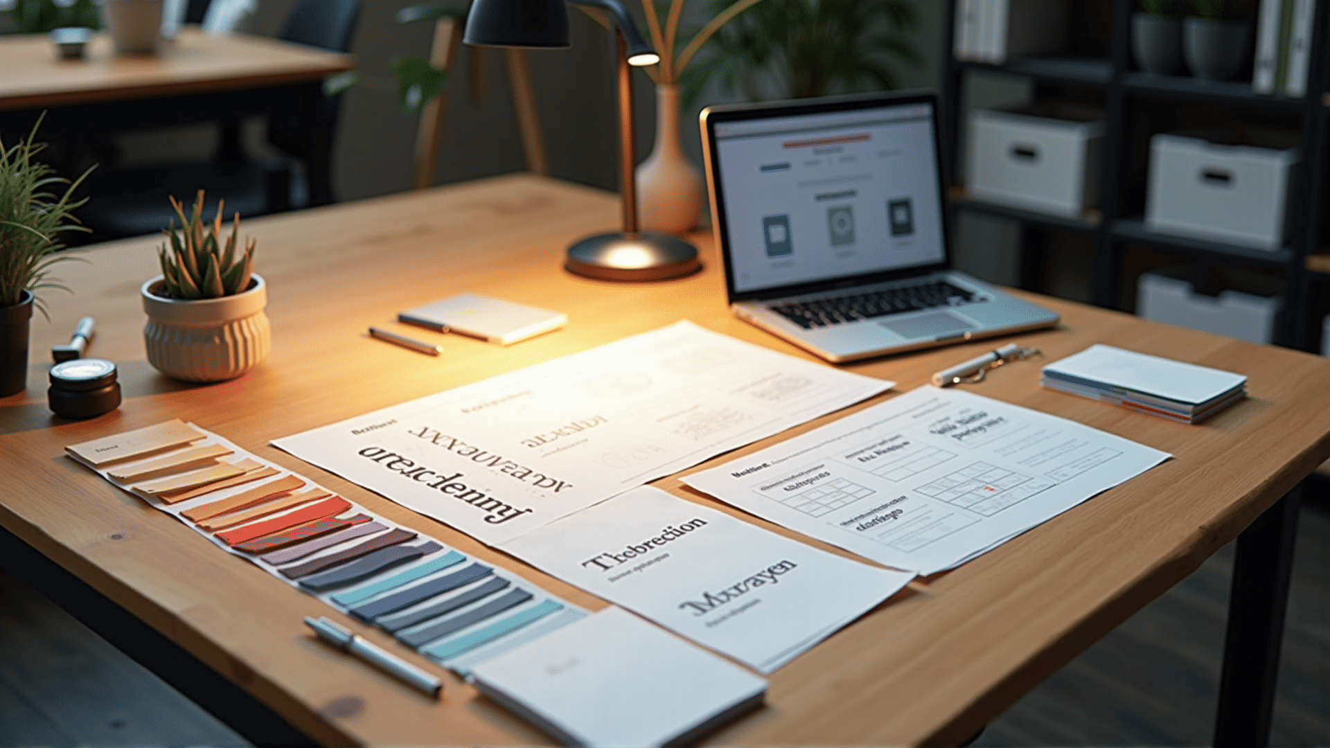
Colors play a crucial role in defining the personality and mood of a website. Selecting a harmonious color palette engages visitors and guides their emotions as they navigate through content. It's crucial to understand color theory to create compositions that are both appealing and functional. The strategic use of contrast helps in foregrounding important elements, while a cohesive scheme maintains consistency across different pages.
A simple approach begins with choosing a primary color that reflects the essence of the site’s message. Complementary and analogous colors can then be added to develop richness and depth. Additionally, understanding how color perception varies across cultures can help in connecting with a global audience, ensuring inclusivity and accessibility.
Typography
Typography is more than just selecting fonts; it is about crafting a visual voice that conveys tone and style. The right typefaces can significantly enhance readability and comprehension. It’s essential to pick fonts that are legible across various devices and screen sizes to maintain a seamless experience.
Pairing fonts thoughtfully can create contrast and highlight important text elements. Headlines, sub-headings, and body text each serve a different purpose; therefore, selecting appropriate sizes and styles for each category ensures clarity. Moreover, attention to spacing, line height, and alignment contributes to a polished and professional look.
Intuitive Layout
The layout is the framework that supports all visual elements on a webpage. A well-thought-out layout guides users naturally, helping them prioritize information and actions without feeling overwhelmed. Employing grids ensures balance and order, allowing for flexibility while maintaining a structured approach.
The concept of visual hierarchy is vital; it dictates the arrangement of elements based on their importance. For instance, using bold text and larger images can highlight key information. Negative space, or white space, is equally important as it provides breathing room and prevents visual clutter.
The consideration of responsive design is crucial in today's multi-device landscape. Ensuring the layout adapts fluidly to different screen sizes enhances usability, providing a consistent experience whether accessed from a phone, tablet, or computer.
Conclusion
Creating aesthetically pleasing websites is an intricate dance between art and function. By carefully balancing color, typography, and layout, designers not only enhance aesthetic appeal but also ensure that a site is engaging and user-friendly. Every element should contribute to an experience that feels both intuitive and delightful, turning visitors into enthusiastic explorers of the digital space.