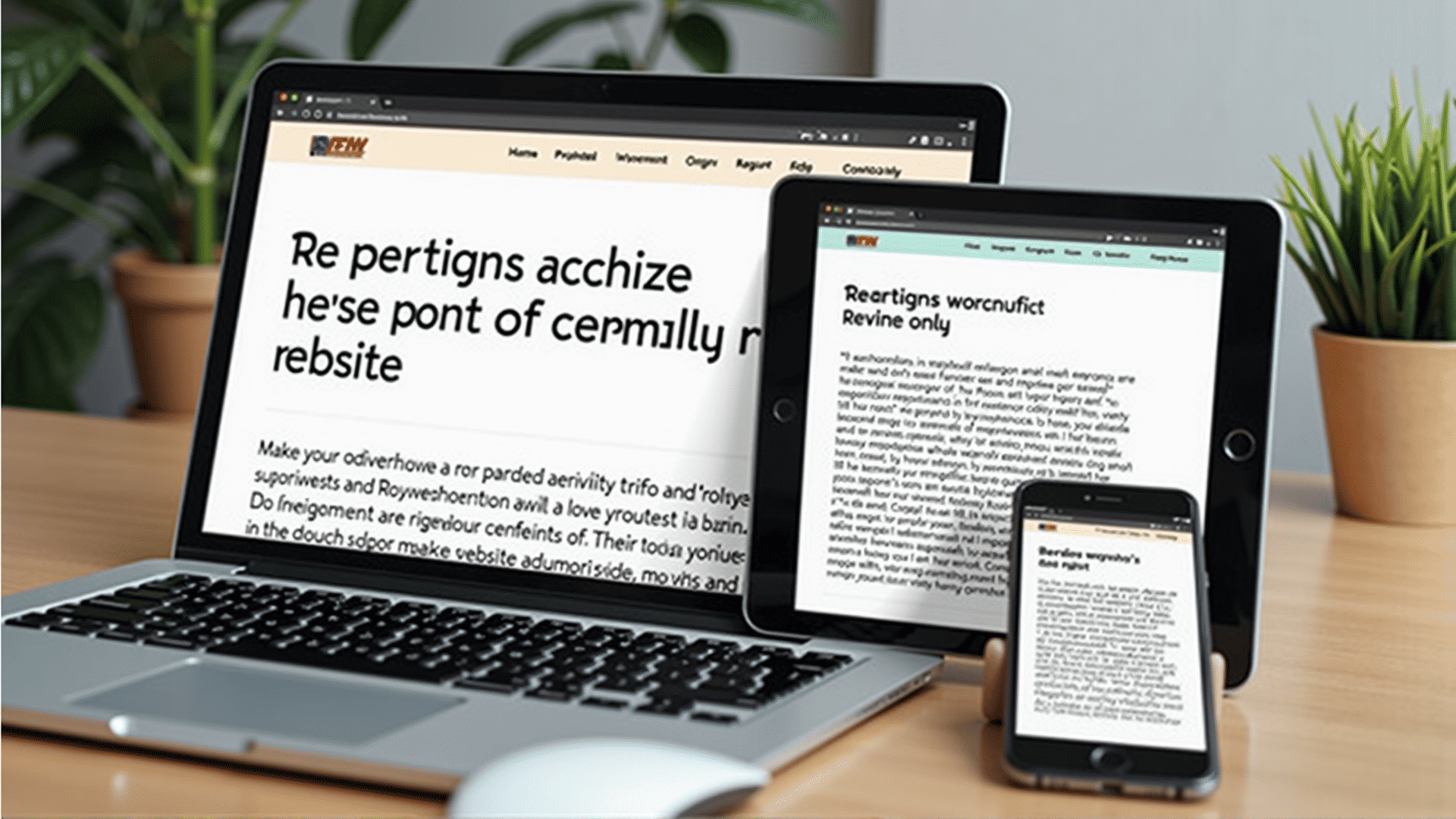
Typography plays a critical role in the success of responsive design, influencing how well content translates across various devices and screen sizes. As the digital landscape continues to evolve, creating a user-friendly experience that maintains readability and usability becomes increasingly vital.
Responsive design aims to provide an optimal viewing experience by adapting the layout to the viewing environment. This includes ensuring that text remains legible and aesthetically pleasing, regardless of whether it's presented on a tiny smartphone screen or a large desktop monitor.
Scalability and Flexibility
One of the main challenges of responsive design is ensuring that typography scales appropriately. Unlike fixed layouts, responsive design requires that text adapts to different screen sizes without sacrificing clarity or visual appeal. This often means employing relative units, such as ems or percentages, instead of fixed units like pixels, to allow for fluid resizing.
Line Length and Readability
The line length, or measure, is a crucial factor in maintaining readability. On larger screens, lines that are too long can strain the eyes, while on smaller screens, excessively short lines can disrupt the reading rhythm. An ideal line length usually falls between 50-75 characters, including spaces, which can be achieved by using CSS properties like max-width and media queries to adjust as needed.
Typography Hierarchy
Establishing a clear typographic hierarchy helps guide the reader's attention and makes navigating content easier. It involves varying font sizes, weights, and styles to indicate the importance of different text elements, such as headings, subheadings, and body text. This hierarchy should be consistently applied across devices so users can easily distinguish sections and find information.
Font Choices and Performance
The selection of fonts has a direct impact on performance and user experience. While custom fonts can enhance the design, they also increase the load time. It's essential to strike a balance between aesthetic appeal and speed by minimizing the number of fonts and weights used. Implementing font loading strategies, like font-display options, can also improve perceived performance.
Accessibility Considerations
Responsive design must accommodate users with different abilities. Choosing typefaces with clear, distinguishable letterforms enhances readability for everyone, including those with visual impairments. Proper contrast between text and background, alongside adjustable text size settings, are fundamental considerations for creating an inclusive user experience.
Testing Across Devices
To ensure typographic choices are effective, it's important to conduct thorough testing across a range of devices and screen sizes. This process helps identify potential issues and allows designers to refine the typography to achieve consistency and clarity throughout.
In conclusion, typography is an integral component of responsive design that contributes to the overall usability and aesthetic quality of digital interfaces. By carefully considering scalability, readability, hierarchy, performance, and accessibility, designers can create experiences that are both visually appealing and functional across a multitude of devices.